
How to Keep Manga Text Style After Translation

A translated manga page can have accurate words and still look wrong. The usual cause is typography: uppercase dialogue, poor line breaks, or text that ignores the bubble’s shape. To maintain text style when replacing translated dialogue, audit the original first, set clear rules, then check every rendered page.
Step 1: Audit the Original Dialogue and Create a Style Note
The first step in learning how to maintain text style when replacing translated dialogue is to study the page before you edit it. Don’t begin by pasting translated lines into empty bubbles. First, mark what changes from panel to panel.
Look at the text region, not only the words. Note the font weight, letter case, line count, alignment, tilt, and distance from the bubble edge. A whisper may use a thin face. A shout may use heavy letters or a jagged shape. A caption may follow a different rule from spoken dialogue.
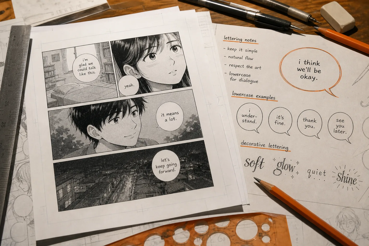
Write these findings in a short style note. Keep it small enough that every translator and letterer will use it. Include rules for:
- Dialogue case, especially whether bubble text stays all lowercase.
- Names, honorifics, nicknames, and repeated terms.
- Profanity strength and the tone of each main character.
- Punctuation for speech, captions, thoughts, and sound effects.
- Font changes for whispers, screams, radio speech, and decorative text.
- Preferred line length and the amount of empty space inside bubbles.
All-lowercase speech bubbles are easy to miss. Yet this convention often keeps English lettering closer to the visual rhythm of the source. A translator who applies normal English sentence case may make every panel feel too formal.
Use a clean reference page beside your work. Mark one normal bubble, one narrow bubble, one curved bubble, and one piece of decorative text. These examples give the team a fixed target instead of a vague idea of “matching the style.”
MangaGloss can give you a first pass by handling OCR, translation, inpainting, and typesetting in one workflow. You still need the style note because a tool can place text correctly while a human decides if a character sounds right.
Step 2: Preserve Casing, Accents, Punctuation, and Decorative Text Rules
When you work out how to maintain text style when replacing translated dialogue, treat case and punctuation as layout rules. They affect the shape of a text block, not just its grammar.
Start with the case rule from your style note. If speech bubbles use lowercase, apply it to the full line. Check the first word after a line break too. One accidental capital letter can make a bubble look like a different lettering system.
Decorative text needs a separate check. Signs, labels, screen text, titles, and sound effects may use mixed case. Don’t force the lowercase dialogue rule onto these elements. Their letter forms often help the reader tell story text apart from spoken words.
Accents must stay in place on uppercase letters as well as lowercase letters. Removing an accent to fit a line changes the word and can make a polished page look careless. Check accented names and borrowed terms character by character.
Punctuation should match the bubble type. A dialogue bubble may need a question mark or a short pause. A caption may follow a different house rule. Keep repeated marks consistent unless the source uses them as a clear visual effect.
Use this quick pass before you judge the fit:
- Read the translated line aloud.
- Check case against the style note.
- Check every accent and apostrophe.
- Confirm punctuation matches the bubble’s role.
- Compare decorative text with the original treatment.
Typography is also shaped by the writing system. Typography concerns the style and arrangement of type, which is why a wording change can alter the visual balance even when the meaning stays close.
For example, a short translated phrase may need two lines after you apply lowercase letters and normal spacing. Don’t solve that by removing punctuation or shrinking the font at once. Test a new break first. If the text still feels tight, shorten the wording without changing the speaker’s voice.
Keep a record of approved spellings. This matters when several people work on a series. MangaGloss supports an editable workflow, so a reviewer can fix wording before the page is rendered again. That lets the team correct the text without rebuilding the whole page by hand.
Step 3: Match Line Breaks, Hyphenation, and Bubble Shape
Good line breaks are the center of how to maintain text style when replacing translated dialogue. A correct translation can still fail if its lines form a stiff rectangle inside a round or oval bubble.
Place the first and last lines shorter than the middle lines when the bubble widens toward its center. This follows the silhouette and keeps the text from touching the edge. In a narrow bubble, use fewer words per line instead of forcing a long line across the widest part.
Don’t add trailing spaces when you insert breaks. A line should end with its last visible character. Trailing spaces can cause odd gaps when text is copied between editors, and they make later cleanup harder.
Read the bubble from top to bottom after each break. Ask three questions:
- Does the eye move through the lines without a sudden jump?
- Does the text sit inside the bubble with even breathing room?
- Does the block keep the same visual weight as nearby bubbles?
Hyphenation needs firm limits. If you must split a word, keep at least two letters on the next line and place the hyphen at the end of the first line. Avoid splitting proper nouns, numbers, or words after an apostrophe. In most cases, rewriting the sentence is better than breaking a name.
Let’s say the translated sentence is longer than the source. First, try a shorter natural phrase. Then adjust the line breaks. Once the wording and shape work together, set the font size. Shrinking the text should be the last small fix, not the first response.
Automatic typesetting can speed up this stage, but it needs review. MangaGloss places translated text into the cleaned page and adjusts the block to fit the available bubble area. If a line looks cramped, edit the wording or break pattern instead of accepting the first render.
Keep the original page open while you work. The goal isn’t to copy every line exactly. The goal is to preserve the same visual movement, so the reader notices the scene rather than the replacement text.
Step 4: Rebuild the Text Block’s Alignment, Spacing, and Orientation
Text style also depends on the space around each letter. To maintain the source look, rebuild the block’s alignment, line height, margins, and angle instead of changing font size alone.
Begin with alignment. Centered text often suits speech bubbles, but a caption or sign may use left or right alignment. Follow the source. A centered block with uneven line lengths can look off if the longest line sits too high or too low.
Set a steady inner margin. The text shouldn’t touch the bubble border, even when the edge is faint or uneven. Keep the margin similar across nearby bubbles. Readers may not name the problem, but inconsistent padding makes the page feel patched together.
Line height matters just as much. A useful starting range for small dialogue is about 1.2 to 1.3 times the font size. Adjust it by eye after rendering. Tight lines can merge into a dark patch. Loose lines can make one short sentence fill the whole bubble.
Control ragging, too. Ragging is the uneven edge formed by lines of different lengths. A little variation looks natural. One very long line beside several tiny lines looks accidental. Rewrite the sentence or move a word to improve the edge.
If the bubble has a clear slant, rotate the text block slightly so it follows that axis. Don’t rotate the letters so far that reading becomes hard. A small angle can make the replacement feel placed inside the art rather than laid over it.
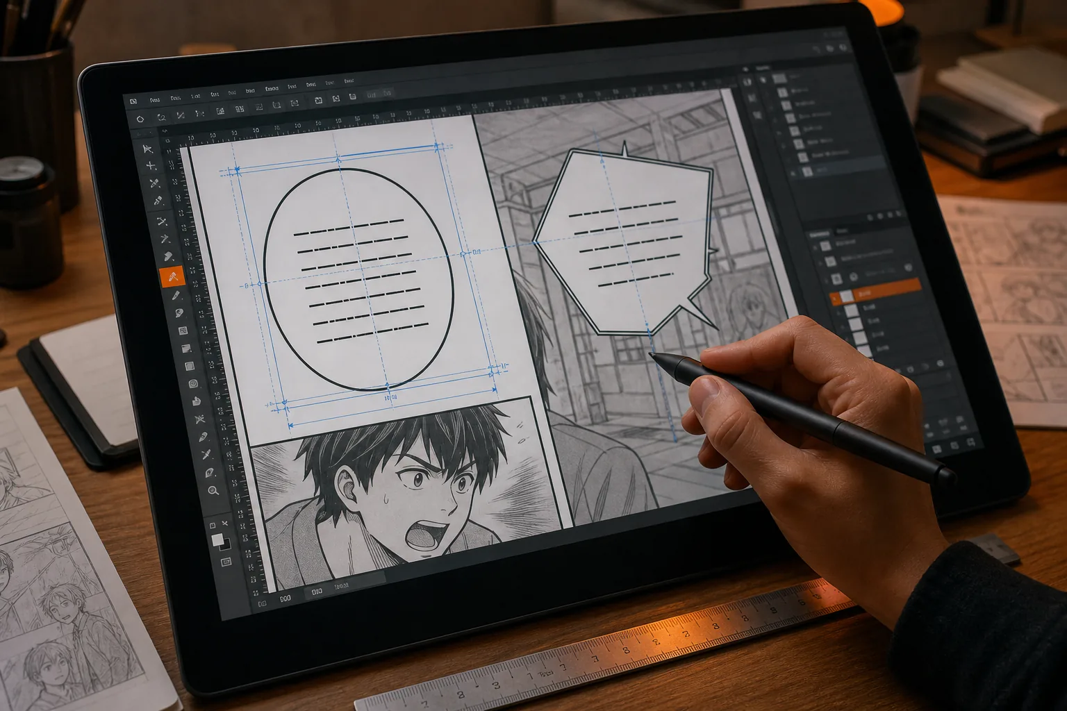
For a manual pass, work in this order:
- Set the block’s width within the bubble.
- Choose the line breaks.
- Set line height and inner margins.
- Align the block to the bubble’s direction.
- Make the smallest font-size change needed.
That order keeps you from using a tiny font to hide a bad layout. It also makes review faster because each change has a clear purpose.
On a busy page, check overlaps with hair, clothing, speed lines, or textured backgrounds. The cleaned art may have details close to the old text area. If the new block covers a key line or face, move it within the bubble or shorten the wording.
When a page needs deep manual control, a graphics editor can help with retouch work. For many pages, though, an integrated editor is less prone to handoff errors. The fewer times a file moves between OCR, translation, cleanup, and lettering tools, the fewer chances there are to lose a font or shift a layer.
Step 5: Replace the Dialogue in MangaGloss and Run a Visual QA Pass
The last step in how to maintain text style when replacing translated dialogue is a page-by-page visual QA pass. Use MangaGloss for the first render, then treat the output as a draft that needs review.
Upload clean source pages in the correct reading order. Let the system detect the text, translate it, remove the source lettering through inpainting, and typeset the replacement. The single workflow reduces the need to copy text between separate apps.
Now review each bubble in two passes. The first pass checks language:
- Is the meaning correct?
- Does the speaker sound consistent?
- Are names and repeated terms spelled the same way?
- Did the translation keep the intended level of force?
The second pass checks the page as an image. Zoom out until the whole page fits on screen. This reveals blocks that are too dark, too small, too high, or too close to a neighboring panel.
Then zoom in. Look for uppercase letters inside lowercase dialogue. Check accents, apostrophes, punctuation, trailing spaces, and broken words. Inspect the first and last lines of curved bubbles. These are common places for a clean-looking draft to fail.
Click any problem bubble and revise one thing at a time. Change the wording first if the block is too long. Change the break pattern next. Adjust size or placement only after those choices are settled. MangaGloss lets you edit text, font size, and placement before rendering the page again.
For teams, compare the final page with the style note before export. One person can read the dialogue while another checks the visual rules. If you’re working alone, read the page aloud, then inspect it without reading the words. Each method catches a different kind of error.
Save the approved output in a clear sequence. Keep the source page and final page together so later edits don’t force you to search through unrelated files. If a term changes in a later chapter, update the style note before you revise old pages.
A final export should feel quiet. The reader should follow the characters and panels without noticing the replacement process. That is the sign that the words and the page design are working as one.
FAQ
Should manga dialogue be lowercase?
Yes, many English-language manga projects use lowercase inside speech bubbles to preserve a light visual rhythm. However, the source project sets the rule. When learning how to maintain text style when replacing translated dialogue, record the case choice in a style note and apply it to every normal speech bubble.
How do I fit translated text into a speech bubble?
Fit translated text by shaping the line breaks before shrinking the font. Keep the first and last lines shorter when the bubble widens in the middle. Set even margins around the block. If the sentence still overflows, rewrite it naturally rather than forcing a tiny type size.
What are common lettering mistakes in translated manga?
Common mistakes include accidental uppercase letters, poor line breaks, trailing spaces, uneven margins, and hyphenated names. A visual QA pass catches these problems. Check the page at full view first, then zoom into each bubble to inspect case, punctuation, spacing, and overlap.
Can AI keep the original manga text style?
AI can handle much of the first layout pass, but human review is still needed. MangaGloss combines OCR, translation, inpainting, and typesetting, then lets you edit the rendered text. You should still check character voice, bubble shape, decorative lettering, and any panel where the new wording is longer.
How should I hyphenate dialogue in a speech bubble?
Hyphenate only when a word must split at a line end. Keep at least two letters on the next line and place the hyphen at the end of the first line. Avoid splitting proper nouns, numbers, or words after apostrophes. A shorter rewrite is often cleaner than a forced break.
Conclusion
Use a short style note, shape each bubble with care, and review the rendered page at both full-page and close-up views. MangaGloss is a sensible place to run the first pass, especially when you want OCR, translation, cleanup, and typesetting in one workflow. Start with one page today, fix the style rules there, then apply them to the rest of the chapter.