
Comic Lettering Fonts: 15 Picks and Tips

Choosing comic lettering fonts can change how a character sounds before the reader reaches the end of the first line. The catch is that many free fonts look ready for print, yet their licenses may block commercial use. Here are useful font picks, plus a clear workflow for testing style, readability, language support, and speech balloons.
Step 1: Start With the License
Before judging the shape of comic lettering fonts, check the license. A font marked personal-use free may work for a private sketch, but it may not cover a comic you sell, publish, or use to promote a paid project.
The entries were marked Personal Use Free or 100% Free. Those labels need care. “100% Free” does not always explain commercial rights.
Bubble Sans licensing information lists the SIL OFL license. That makes it the safest first choice here for a creator who plans to publish. Still, read the license file that comes with any font before release.
Step 2: Match the Font to the Voice
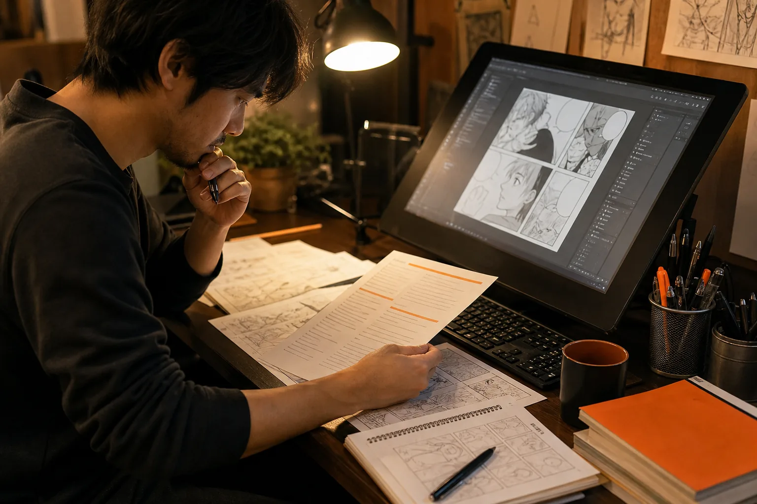
Good comic lettering fonts support the character’s voice without stealing the scene. Start with the character, not the font menu. A calm detective may need a plain, steady face. A loud villain may need heavier shapes, but the words must still scan fast.
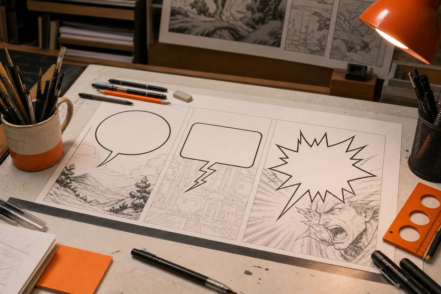
Think of the font and balloon as a pair. A blocky face inside a square balloon can suggest a machine. A rounded balloon with the same face can make that machine feel less harsh. A pointed radio balloon can suggest speech sent through a device.
The best choice depends on the art around it. A highly ornate font may fit a title or spell effect, yet fail inside a small speech balloon. Use strong visual cues only when they add meaning.
Step 3: Check Language Support
Language support is a key test for manga, manhwa, and manhua lettering fonts. A font can look perfect in English and fail as soon as you add Japanese, Korean, or Chinese text.
Bubble Sans is the only sampled font that advertises support for over 300 languages. The other 14 entries had no language-support data in the review. That does not prove they lack every needed glyph, but it does mean you should test them yourself.
Paste a real sample from your script into the font. Check accented letters, punctuation, quotation marks, numbers, and the scripts your edition needs. Missing glyphs can appear as empty boxes or a fallback font, which makes one speech balloon look out of place.
If you’re localizing a chapter, font support also affects the handoff between translation and typesetting. MangaGloss can help with that workflow by detecting text, translating it, removing the source text, and placing the new wording on the page through its AI manga translation workflow.
Step 4: Test All-Caps and Mixed Case
Many classic comic lettering fonts use all caps. That look grew from hand lettering and the need to keep words clear on rough print stock. It also gives dialogue a firm, even shape across the balloon.
Test both all caps and mixed case with the same line. Look at narrow letters such as I and L. Then check round letters such as O and G. Some fonts have comic-style rules for the letter I, while others use a standard crossbar that can look wrong in dialogue.
Use a short test sheet with these lines:
- “I saw the signal.”
- “Wait. Don’t open that door.”
- “WHY IS IT MOVING?”
- “The temperature is dropping.”
View the sheet at the size readers will see. A font that looks charming at 48 points may lose its counters at a small phone width. Readability wins over novelty.
Step 5: Build a Shortlist
Once the license and language checks pass, compare a small group of comic lettering fonts. Avoid downloading dozens and judging them by name alone. Put the same dialogue into each sample so the differences are easy to spot.
Useful free entries in the sample include Kaboma, Caped Crusader, Comic Boom Elements, Funny & Cute, Komika Bubbles, Vigilante Notes, Kangaroo Court, Toon Town Industrial, Comic Panels, Mushy Love, Comic Marker Deluxe, To Japan, Talkies, and Freaky Comment Balloons LT.
The listings describe most of these as Personal Use Free. Komika Bubbles and Freaky Comment Balloons LT are marked 100% Free, but the sample does not provide an open-source license for either one. Treat unclear wording as a warning, not permission.
FontSpace comic and speech font listings can help you browse styles, but the listing page is only the start of your check. Save the license with your project files and record the font version you used.
Step 6: Place the Balloon Before Polishing
Comic lettering fonts work best when the balloon shape and page layout are planned together. Start with the script and thumbnail. Mark where each line should sit before you tune the font.
Keep the reading order clear. A balloon near the top of a panel usually comes before one below it. Tails should point toward the speaker without crossing faces, hands, or key action. If the tail must travel far, the balloon may be in the wrong spot.
For normal speech, try a centered diamond pattern. The first and last lines stay shorter than the middle line, which gives the text a balanced shape. Do not stretch a balloon to fit a bad line break. Rewrite the break or adjust the text block.
Use color with restraint. Cool colors can suggest cold or distance. Warm colors can suggest heat or rising tension. Keep the text itself high contrast, and make sure the color cue still works in grayscale.
Step 7: Set Up the Lettering Workflow
A clean workflow keeps comic lettering fonts easy to change. Work on a separate text layer or file, rather than baking every word into the art at once.
In a vector editor, place the page art and dim it while you enter the script. Center the dialogue, set line breaks, then shape the balloon around the text. Draw the tail with a pointed end and join it to the balloon when the form looks right.
Keep the original text editable until the last review. For special effects, duplicate the text before converting it to outlines. That lets you keep a clean version while you distort, rotate, or split letters for a scream.
Export a transparent layer when you move the lettering back into a painting program. Check the page at full size, then check it as a small thumbnail. Text that blends into line art may need a heavier outline or a small change in placement.
Step 8: Design or Pair With Care
If no font fits, design a custom comic lettering font from your own hand-lettered samples. Write the full alphabet in the style you want. Include upper and lower case if needed, plus numbers and the punctuation used in your script.
Pay close attention to repeated shapes. Your A, R, S, and G can become a signature. Decide how wide the letters should be, how much space sits between words, and how the letter I works in a word versus by itself.
You don’t need a special effect on every line. Use one main face for normal speech, then add a second style for a clear story purpose. A different face can mark a broadcast, a monster voice, or a burst of sound. Too many styles make the page feel like a font test.
The sample review found no listed OpenType features across all 15 entries. That leaves room for a better premium font built for speech balloons, with stylistic alternates or contextual forms. Until then, strong spacing and careful editing matter more than a long font list.
For translation teams, MangaGloss is a useful place to test the full page rather than only a font sample. Review the translated text inside the balloon, then fix names, terms, or line breaks before export.
FAQ
What are the best comic lettering fonts?
The best comic lettering font depends on your license, script, and art style. Bubble Sans is the strongest choice in this sample for commercial manga work because it lists the SIL Open Font License and support for over 300 languages. Other fonts may look appealing, but check their rights and glyph coverage before publishing.
Are free comic fonts free for commercial use?
Free comic fonts aren’t always free for commercial use. “Personal Use Free” usually signals a limit, while “100% Free” may still leave the legal terms unclear. Read the supplied license and keep a copy with your project. If the rights aren’t clear, choose a font with an explicit commercial license.
What font is used for manga lettering?
Manga lettering doesn’t use one universal font. Letterers often choose an all-caps face with even strokes, open counters, and clear punctuation. For translated pages, the font also needs the right language support. Test the actual Japanese, Korean, Chinese, or English text instead of judging the Latin alphabet alone.
How do I make comic lettering readable?
Make comic lettering readable by testing it at the final viewing size. Use clear line breaks, enough space between words, and strong contrast against the art. Keep the balloon tail aimed at the speaker. If a bold effect slows down reading, reduce the effect before shrinking the text.
Can I use AI for comic lettering?
Yes, AI can help with parts of comic lettering and localization, but you still need a human review. MangaGloss can automate OCR, translation, inpainting, and typesetting for raw comic pages. Check names, tone, balloon fit, and license rights before sharing or publishing the finished page.
Conclusion
For a comic you plan to publish, start with Bubble Sans, then test it against your real script and page size. If you’re translating a manga, manhwa, or manhua chapter, upload a small set of pages to MangaGloss and review the finished balloons before you commit to the full chapter.